Saturday, September 8, 2012

Temporary Post for CART 351

Due to a computer failure, I'm going to temporarily update here for CART 361 until I can get my site situation back under control.

"How Does the Network Effect You?"


Plan: Make a randomly generated network that simulates the transmission of an action from node to node.

Inspiration: On Facebook there are items that require a "like" (or some other release of personal information) in order to perform an action (See quizes like What Superhero Are you?). As a byproduct of this action, this same item will pop up on all the friends' Facebook pages and entice them to action. What causes these to work? What benefit do they get?

Do we know how much seeing the same item over and over can change our views if those items are connected to people with influence? Who are the true influencers anyway?

My response is a cryptic game, where you can play any way you'd like, but can you keep your large node blue while turning all the others red?

EDIT: Having issues with host removing ftp service. :( Not happy.

Thursday, December 9, 2010

Monday, November 29, 2010

214: Visualization

PDF: VanRossum_Nara.pdf

VisFinal_CropView

I sent it to the printer and hope to pick it up tomorrow morning. I found a spelling mistake in my print file, however. I keep forgetting 'transPARENT' not 'transPERANT'. Doh!

Wednesday, November 24, 2010

CART214: Info visualization Progress

Print

I’m trying to play-up the idea of a confusing squeeze. I’ve left out all elective classes so far. I’ll take me a lot of time to create the data for those and I’m not sure how to even show them without it becoming a mess (more than it is). I like the shape turning into gritted teeth, but I may also want to break-up the pattern highlighting the days which are a breeze to schedule. Monday in winter term starts becoming impossible at the 300+ level, but the main issue is trying to squeeze in all those 200 level classes that are pre-req for the later classes. The graphic is more about frustration and planning under unfavourable circumstances than it is about the program in general. The areas I’d highlight are the conflicts between ENCS 393 and everything, as well the minor grudge-match between CART 411 and COMP 345.

I condensed the 300 and 400 level because of how few 400 level classes there are, especially since I didn’t left out the electives. Adding the electives will add a whole bunch more research.

I need to get some rest. Discrete Mathematics test tomorrow.

CART211: Response Catch-up

Magic in the Stone

I felt the most interesting parts of this reading was how it connected the seemingly very different things I’ve been learning about in my other classes (mostly Boolean algebra and java coding). The idea of creating a computer from switches wasn’t new to me, however, the idea of the levels of abstraction creating a sort of magic was not something I had thought of before. Magic as a continuously abstracted and built upon base of binary was very interesting to me, and I might use that idea in a fiction project in the future.

The early computers seemed very game-like, with simple rule-sets and simple mechanics to create something that reacted to ‘coding’. However, I had a lot of trouble figuring out his diagrams. Though I could understand the circuits (and liked how they connected nicely with the and and or of Boolean logic), the mechanical ones were difficult to grasp, I supposed because I haven’t seen similar diagrams before and don’t know how they would actually move or function.

Hydraulics was an novel take on the binary/analog idea. I suppose instead of it being ‘and’ and ’or’ driven it would be ‘enough of both’ and ‘enough of either’, where ‘enough’ triggers the switch. It becomes less Boolean and more functions and relations nested in Booleans. Eg: P(x,y,z): (x+y=z)

Though removing the binary from the computer might be an eventual goal, I’m not really sure if we would want a computer that could be at the most basic level is uncertain (when something can be neither true nor false).

I admit that his descriptions of the inner workings of a modern computer with “restoring logic” really lost me, especially the idea of how transistors conserve the voltage like a valve conserving water pressure. I suppose I’ll understand it better once I take COMP 228: System Hardware next term.


Ubiquitous Computing

It was interesting seeing how Jun Rekimoto first presented a problem, suggested a solution, went into a conceptualization for the user, then looked for ways to give the user positive feedback from the action. It seems like a really simple idea when you first look at it, I suppose that shows how well people would be able to adapt to it. It seems simple only when you look at it from a point of view that ignores the technology behind it, but I can see how this kind of view-point would be best for creating interfaces that work hard to interact with humans and not the other way around.

The idea of computers which are aware of context is one that really expands what computers can do and how well they can react to people. For some examples: a computer that knows when the user is stressed could improve performance and cut back on background tasks so that programs run more smoothly, or a context sensitive computer might control an environment, being playful (projecting interesting images on random objects), serious (controlling light and sound to increase productivity) or even useful (projecting a clock on the wall in front of you to remind you of an appointment, etc.)

Seeing as how much of a problem it was trying to create a “universal remote” for TV/video players, I see this running up against resistance from the technology makers. If you can only use a specific input device for a product then they can sell more input-devices. The kinect is interesting in that way, since the controller is actually a camera, however, since each object having it’s own camera might get cluttered as well, the idea of unifying input is probably going to be very important in the future. Once a company has spent the money to develop a novel input system, however, it seem unlikely to want to share it among competitors. This is definitely a hurdle for unified input like Jun’s pick-and-drop.

Wednesday, November 17, 2010

CART211: Response

The article on physical computing really highlighted how much trouble I have think in terms of high/low level thinking. I find it very difficult to divorce concept and production. The author presents a good case for keeping the technology and concept separate from the start.

A fascinating aspect that was just touched upon was the the computer's ability to reduce the barriers of time and space. The idea of multi-dimensional-time-travel-illusions is difficult to resist.

Expanding the view of what inputs a computer might want to read off of a human is a bit difficult, the reason why keyboards and mice work is that people have adapted to them to the point of stopping/reducing the sense of body when at a computer. Typing is generally unselfconscious.

Taking it from another angle, if the computer had to take readings off of a human, it would want the most information it could have to make a context dependent, decision. Taking that example of the automatic blinds that could sense temperature and light, maybe it would also want to know if there was someone in that room, what they were doing, maybe even if the brain-waves of that person were indicating an aversion to the heat or light?

The input/output divide is also interesting, but new input methods seems to be a lot less open a topic than new output methods. With both methods, I have a lot of difficulty getting away from the mouse-keyboard/screen-projectors methods. I suppose that comes with time.
Seems like a good book. I'm not sure if I'll finish the parts on circuits though.

-----------------------------------------------


The article on Hiroshi Ishii and his student’s projects was very interesting. The elements that stood out for me were those of engaging more than the eyes and the TUI’s requirements for very mutable objects.

Movies definitely capitalize on the fact that it is very easy to get lost in sight and sound and ignore the physical, but which came first, our ability to be disembodied for entertainment or media that focused excessively on only one or two senses and strove for total immersion?

The idea of having sound, touch and action play a larger role in our interactions with technology brings up some interesting questions: will the computer receive the information straight from the user and need to interpret it, or will this tangibility come as part of a more tangible/audible controller? An object you mould in your hands to control a visual space could be very interesting, but how would it deal with having a lot of functionality? Click/tap/gesture/press where and why? If it is just a learned behaviour, the object becomes a controller with physical methods rather than typing/mouse-movement. If the object interprets physical actions as they come, without this option for controlling the less intuitive parts, the experience is very different.

A Wacom for example, is fairly tangible. Its strengths are gestural, its weaknesses are control. It has trouble being adaptable enough to become the sole way of interacting with the computer data. A clay ball control would probably have similar troubles: being great for manipulating, but bad at triggering and controlling a wide array of programs.

Without the object (like a projection illusion) the options would be more malleable, but the tangible nature is a lot less stressed. Just like the wiimote, it won’t take long for someone to boil such gestural and active interaction down to the least possible movement.

Having worked with databases over the summer, I found the idea of a stackable/rack of objects representing data to be very interesting. The problem of saving, storing and recreating these combinations is the only thing that seems to be a problem to me. If the objects were smaller and easy to store in their combination, it could be a very interesting tool for dealing with complex data analysis.

Tuesday, November 16, 2010

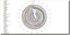
CART214: Infographics

Option 1:

Number of scientific and technical journal articles by country and either number of universities, overall population or GDP.

image

The approach would be one of information texture, seeing the information added to world knowledge by number of people involved.
This is mostly if Option 2 doesn’t fly.

Option 2:

Using my own dataset on CART/COMP classes, studying the number of classes offered and number of pre-requisites, by time of year offered. Highlighting classes useful in computation arts, but difficult to schedule or fulfil requirements for.

image
* not counting: Independent Study, Internships and Special Topics

graph1
Three options of examining data.

The first bar-graph would be expanded to examine scheduling/requirement eccentricities, focussing on peculiarity and humour.
The first of the three sketches focuses on options and possibilities outside of the core classes in CART. The second focuses on the increasing number of non-core classes required over time in the program. The third takes a critical look at the non-core requirements in Cart and Comp over three years, highlighting the most potentially useful computer science classes to computation arts.

Wednesday, November 10, 2010

CART211: Instrument

I was most interested in  in the idea of an instrument that you could influence but not control. One idea is for an instrument that requires a group of people to play. A jungle-gym like structure where individuals move through the spaces (each with different acoustics and opportunities for sound) creating sound through active use of the space. Mixing dance and music seems like a good fit. A building that is a musical instrument would be an extension… Hallways that echo and reverb and play back sounds from previous musicians. Different floor materials and room shapes, as well as ambient noises all add elements to the music. Unlike must musical instruments however, something this large would have to be tied to a specific location. The music created would either be participatory or highly performative, because the results are difficult to repeat and may be difficult to record. Also, there would be something lost in the recording process: the visual/situational elements are also very connected to this type of instrument. I imagine running through the halls making music, or a gym that plays back remixed versions of the sound its members are making while working out. Spatial and active interaction with the instrument alters the sound around you, essentially helping to build a real soundtrack to a person’s life.

Monday, November 8, 2010

CART214: Icons

icon1 icon2 icon3 icon4

icon5 icon6

Five Icons and a bonus.
Study-Zone, No-Endless Computer time, Juggle Everything, Sleep-stop, It-costs-money-don’t-you-dare-want-it, This-is-a-leg’it-Zone.

Data-Sets I liked:
http://www.cdc.gov/nchs/fastats/access_to_health_care.htm
http://www.cdc.gov/nchs/fastats/healthy.htm

Wednesday, November 3, 2010

CART211: Reading Response

*See main site for the final project proposal.*

The Joseph Weizenbaum article, “From Computer Power and Human reason: From Judgement to Calculation”, was an interesting read. I agreed with a lot of his basic points but don’t agree with his conclusions. I was moved by the passages about science as a creative pursuit and about the limiting of science to calculating the solution to problems as limiting or denying the power and freedom of thought.

That psychologists were so eager for some sort of technology to take over aspects of their jobs surprised Weizenbaum, but being a lazy, hopeful human, I can understand the wistful daydream of finally not doing the tedious parts of my job, delegating it to someone/something else. The way I see it, the training involved in some positions leads to a feeling of having been “programmed”, where individual approach is counter-productive and looking for a way to distance oneself from being the “information processor following rules” is to jump at the chance to have some of that tedious burden lifted by a machine.

Modeling is very important to understanding complicated systems, and there are risks in every model if held too long. The “autonomous machine-like process” in a lot of ways seems to follow from the “factory production” model that was used for nearly everything after the industrial revolution kicked in. Both models dehumanize by minimizing the impact of individuals in the system, while they also put emphasis on efficiency and a non-emotional approach.

Weizenbaum then goes into his reasons against the science “drug” and rationality-is-logicality approach to decision making. The point I found that helped me reconcile this with my belief in the path of questioning (and science) was where he highlighted that science is built “on the shifting sand of fallible human judgement, conjecture and intuition”. What I took away from the article was that science itself is not bad, but the belief in any one part of it can hinder it and make it take on too much of a presence in every-day life.

Constant tearing down and rebuilding can do a lot of good, but I suppose scientists want to move forward, and you can’t do that if you know all you’re standing on is the “shifting sand” of humanity. Losing the assumption of a stable world, the autonomous model really doesn’t look quite as plausible. However there definitely are two different overlapping skill-sets between humans and computers, so there’s no real reason why they must be exactly like us anyway.

Tuesday, November 2, 2010

Monday, October 25, 2010

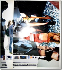
CART 214: Memory Map and Collage

The text in the collage didn’t come out very legible, however I’ll write out what’s visible below.

Ephemeral2Collage

Collage text

Top right corner:
… is optimism ran deep, beyond the …
…ess joyously, you might wind up…
…has in years: the strong promi…
…ers with staying power ma…
…houlder boys turne…
…olyed effort th…
…centric a…
…lazzling…
…ete…

Bottom left corner:
like any other
fit the most exacting specifications --- crafted with obsessive
attention

Wednesday, October 20, 2010

Cart211: Week Six

*** PDF: Expanded Narrative Storyboard


Responses:


What is Interaction Design?
I enjoyed the article’s take on the changing focus of interaction design from technological capabilities to ideal interfaces. He raised a lot of points and I felt like while I was reading I was just trying to digest the categories and lists into smaller chunks.
Usability, utility, satisfaction, communicative, sociability. Of this list, I think I understand the last element the least. There was one paragraph on it basically saying “people need to socialize”, but compared the the other points it didn’t hot home with me.
In a lot of ways, while learning how to design technology, it’s easy to fall into asking what can you build rather than what your users want to do. This might be related to the growth of the medium as well as the learning curve of those involved.
Symbolic and practical functions as both valid parts of the whole was one interesting point brought up.
Implicit meaning reminded me of intuitive learning from the text on Will Wright, adding these two concepts together is very interesting for me along with the concept of reassuring feedback. The mouse “hover” over links is an example of common feedback that you don’t notice too much until it’s gone. Suddenly it becomes much harder to pick out your options.

People and Prototypes
What I found most interesting here were the diagrams dividing design into different disciplines. I don’t think I’m a designer using the unconscious mind to deal with expansive constraints yet. From the way the author describes the many problems design needs to be constrained by, it feels like less of a foundation and more like a bed of nails.
I can’t find all that much more to say about this one.

Will Wright the Sims
I wonder how many people did not choose to read about Will Wright?
I enjoyed how out of the box he was, he seems to have a very interesting viewpoint that makes the unexpected seem really to have made sense since the beginning. He talks about issues with the peaks of popularity attracting more games leaving the rest of the map unexplored, but having grown up on games from those peaks, I find it really hard to get as much of an outsider view as might be needed to create and market a game that wasn’t all Story and Plot, Skill and Achievement and Strategy and Consequences.
I  liked the idea of a player becoming the game’s curator due to choices. It also reminds me of how user generated content has been nerfed quite a bit in the sims3, there are user-made porn-packs for both Sims 1 and 2, but because of the way the Sims 3 is set-up, creating full mods is more difficult (there are a few, but they mostly alter game-play mechanics and not the models directly), while creating sanctioned content is fairly easy, with built in online sharing.
Creating a game where failure is enjoyable is an interesting goal. It sounds like one way to think outside the box is to really observe people at play.
The article presents really simple but insightful instructions on how users learn a game/interface: How to play/act/move, discover the failure states, then slowly learn how to thrive. Mapping complex things into your instincts and your intuition makes sense, but I never thought of it that way for controls: finding intuitive associations between very different phenomena could allow people to easily control something generally seen as complicated…
Soil, seeds, flowers and weeds…
"What is the simplest possible system that I can build that for you is going to decompress into the most elaborate set of possibilities?"

Sunday, October 17, 2010

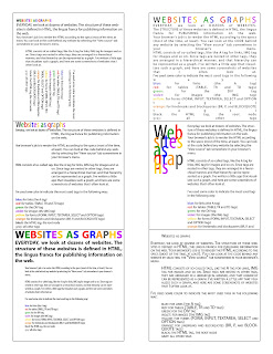
CART214: Data Visualization


This programming app creates diagrams from website code.
Unfortunately, screen-shots don't look very good blown up, but I hope these still work out.


Wednesday, October 13, 2010

CART211: Week Five

Response:

This is my second reading of The Garden of Forking Paths, and I found it refreshing to have forgotten it enough so that it could surprise me again.

What I found interesting this time around was how the stories nested within each other. There is a stream of consciousness that leaves out important links between different elements (much like the omission of time in the Garden of Forking Paths within the Garden of Forking Paths), the narrator presents his driving forces then glides over them until they are suddenly resolved in the last paragraphs. There is a disconnect between the narrator’s described experiences and his outward actions that is unsettling, but highlights the idea of a piece of literature as a maze where one of many futures takes place. Being loose pages, essentially the story itself could have been just one of the many forking paths of the garden.

The missing beginning created an interesting inertia where it took longer to piece together the person and the problem. I’ve found there are a few movies and games that are more interesting if one misses the first few minutes where they usually set up the entire story and introduce all the characters and their paths.
The image of the infinite labyrinths was very compelling. A very fractal country side.

The labyrinth that would “encompass the past and future”(32) that Dr. Yu Tsun describes while walking to Dr. Stephen Albert’s house, is interesting to compare to Yu’s self-imposed “future as irrevocable as the past”(31). I’m still not very sure where those two concepts match up.

Monday, October 11, 2010

CART211: Week Four

When using watercolours and inks. Ink first, then colour, because the inks
are less likely to get pushed around by so much layering. :/


Analogous ---------------------- Complementary
 
Double Complementary -------------------------- Monochromatic
Split Complementary ----------------------------- Triadic

Wednesday, October 6, 2010

CART211: Week Four

See my main site at http://hybrid.concordia.ca/~n_vanr/ for this week’s update. (Big black button! See it? Up! Up! Next to the stained glass lady!)

Wednesday, September 29, 2010

CART211: Class Two

Response:
I would be untruthful in presenting my reactions if I didn’t start this response with:
“Okay. That’s fucked.”

This was my initial reaction reading Gregory Little's "A Manifesto for Avatars." I needed to even write it in the margin notes of my print out (next to the section 1. Introducing Avatars) before I could move on with the rest of the article. Taking "when goodness grows weak, when evil increases, I make myself a body"(1) out of context to makes it easy to suggest that making a body (an avatar) was a corruption, where, when I looked up more of the passage online it seems to suggest it was more a reaction to evil: "In every age I come back to deliver the holy, to destroy the sin of the sinner, to establish righteousness."(2)
I got the feeling that Little enjoyed trying to provoke the reader with such suggestive terms as "strap-on"(3)Little warns of 'dangers' involved with creating avatars, of becoming an image that is "an emblem of of the production and accumulation of goods"(4). I believe he raises some valid points, but at the same time, undermines them by taking such a confrontational and overly complicated approach. Little writes "the space of the internet must become a site of resistance and the avatar must be grounded in an alternative, post biological discourse of the body."(5) Does everyone need to be part of this discourse 24/7? Does Little want the internet to be a difficult place where people escape it by returning to work as a refreshingly faceless and unremarkable being? When every avatar is grounded in an alternative, post biological discourse of the body, will people be happier? I really doubt it.

The areas I'd like to look at in depth are:
Fixed Identity vs. Avatar
Cyborg vs. Avatar
Docile Bodies (?) vs. Online Agency


As for the article by Mike Jones, I believe he raises valid points (but in a thankfully bland way compared to Little). When talking about virtual communities, Jones writes "it is hard to envisage anything more than a surface contact between fragmented entities, partial selves peeping out from behind the mask of anonymity."(6) This same statement could be talking about university, or a large work place, or a busy pub. The internet is a big place, where at any given moment people could be off-line. It makes sense that communities there would have trouble. At the same time the fact that the person on the other side of a conversation has so many details and so few ways to demonstrate them on-line (with skype, this is getting easier), lets people fill in the gaps with whatever they need/want/fear to create some very deep one-sided connections. 
Until you learn to assume the internet is filled with jerks, the internet IS a wonderful place.

1. From Bhagavad Gita 4:6-10 as quoted by Little, "A Manifesto for Avatars", page 1
2. From Bhagavad Gita 4:6-10 as quoted on http://www.atmajyoti.org/hi_gita_commentary_33.asp
3.  Little, Gregory. "A Manifesto for Avatars", pages 1, 3
4.  Little, Gregory. "A Manifesto for Avatars", page 2
5.  Little, Gregory." A Manifesto for Avatars", page 1
6. Jones, Mike. "hello, and what are we today?", page 2


Jones, Mike. "hello, and what are we today?" http://www.garfnet.org.uk/new_mill/autumn97/sa.htm (accessed Sept 29 2010)


Little, Gregory. "A Manifesto for Avatars". published in "INTERTEXTS", Special Issue: Webs of Discourse: The Intertextuality of Science Studies, volume 3, number 2, Fall 1999, Texas Tech University Press, Lubbock.


----------

Media and Links:
A paired down descriptions of Avatars, but making a distinction between playing a character and having an avatar: 


Tempted with unlimited choices for your avatar, you are initially presented with limited ones, this confirms some of Little's arguments about manufacturing want:

People that like Avatars also like Comparing Avatar Creation:
These often glide over the amount of choice, especially non-U.S.-idealized choice. Often there is only one body model with paint-fills instead of racial differentiation. It makes sense from the creator's side, however, as adding that much detail in choices is a lot more work.

Something more along the line of this article:
These are more social and science based. They don't have very much detail up about most of their projects, however there are these three articles: 
http://vhil.stanford.edu/pubs/2008/ersner-aging-writeup.pdf <-- aged avatar increases savings for future. Not really connected, but still neat.

Sunday, September 26, 2010

CART214: Class Three

Research:

(All images are links to their source page.)

1920 – 1940: Paintings

A September Gale - Arthur Lismer (1921)
Breaking down reality into perfect elements seems to be the theme of this time period. This early group of seven piece is asymmetrical and slightly off balance, the colours and rhythm of directional elements create an energized feel to it. I have trouble keeping my eye on the right, my eye always sweeps with the current.


Portrait Of Madame Boucard - Tamara de Lempicka (1931)
Also of interest.

More formal use of shape here contrasting with the very organic fur of the cuffs. The arms and face make a rhombus that keeps the eye mostly in the top half of the image.

1940 – 1960: Posters

Poster for the cancelled 1940 Olympic Games
The simplification of form was used here to create a clear, direct poster. People were busy, messages probably had to be clearer, faster to read. Two important elements and asymmetrical balance, tosses the eye between the word Finland and the woman at the bottom. The eye is very strongly directed around this composition.

We've Beaten Them Before - Soviet poster (1942)

Suddenly they had to use what they knew about composition to create something emotionally compelling, the design is still fairly simple, but the details and contrasts create a more active, urgent picture.


Forbidden Planet - 1956
So we have compelling and clear... abused for mass marketing. Actually what I think is added here to the mix is interesting visuals. The composition is trying to keep the eye at the top of the page, but the picture leaves story up the the imagination. 


Grande Ballroom Grand Opening - Gary Grimshaw (1966)

Interesting visuals starts taking the lead, dropping clarity by the wayside. If it looks awesome but is hard to read, only the awesome people will attend, right? Stylistically, this breaks a lot of rules (too much text... at too many sizes... lines leading the eye off the page...) but it challenges the reader to pay attention, to be curious enough to understand it.

1960 – 1980: Album Covers

Days of Future Passed - The Moody Blues (1967)
Unusual visuals with a flipped symmetry make this interesting and eye-pleasing. The text in the top hand corner, however, feels like a total afterthought.

Bitches Brew - Miles Davis (1970)
Unusual, clear, playing with asymmetry and symmetry, the images are evocative and layered in potential meaning.

Grace Jones Studio Album Covers 1977–1989
When evocative fails to work, the 80's try shocking. The effort to stand out in a sea of other images really shows in these covers. Grace Jones starts with an interesting look, but keeps exaggerating it just to keep up with all the other images. The covers on the top row use text and painterly elements to create rhythm, while the middle row deals mostly with scale and tone contrasts. The two on the bottom left deal with rhythm more directly, creating a pattern from the repetition of elements.

1980 – 2000: Advertisements

Blarhg! Working on it! These are much harder to find online. There has to be a good collection out there!


Rhythm and Repetition:


Here are my attempts at Rhythm and Repetition.


One graphic element: Bilateral Symmetry

One graphic element: Rhythm

One graphic element: Radial Symmetry and Depth

Two graphic elements: Asymetric Balance and Rhythm

Three graphic elements: Asymmetric Balance and Complexity

Free Composition


Wednesday, September 22, 2010

Cart211: Class One

Thinking about networks I realized I'm not very spread out in my networks...

Most of my on-line activity is fairly solitary. Facebook, RolePlayMarket, DeviantArt, and Inkboard.Net being notable exceptions.
These were some of the inspirations for my attempts:
www.visualcomplexity.com/

http://www.blogviz.com/

There is a real fetish attached to charts and diagrams, especially masterful ones. Visual omnivores digest knowledge and one way to get it is through diagrams. (XKCD is a good example) Fractals and generated art give the eyes a lot of iterations to look at... Similarly to how illustrators/artists try to create complicated colours and patterns with watercolour or other paints, programs and programming can gain different but similar qualities.

composition by Veronika Schmidt,
 found at 
http://nodebox.net/code/index.php/Introduction 

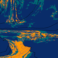
Unplanned Muse by Nara Van Rossum Aug. 2010

The idea of injecting texture into digital work isn't new, but I've never really thought of it the other way around, creating complexity digitally from programmed input. Often textures are used to hide the digitalness of a work.
Eg: city-diversity by Betteo of Deviantart , Bamboo by Ikenai of Deviantart

http://cgtextures.com/ is one of the one-stop-shops for complexity from photos.

I suppose I'm still attacking these topics from a highly visual standpoint. All of my education so far has been heavily visual, as well as heavily applied to illustration rather than art. I think it will take me a few weeks for me to really get a feel for the real expanse digital arts.