Wednesday, September 29, 2010

CART211: Class Two

Response:
I would be untruthful in presenting my reactions if I didn’t start this response with:
“Okay. That’s fucked.”

This was my initial reaction reading Gregory Little's "A Manifesto for Avatars." I needed to even write it in the margin notes of my print out (next to the section 1. Introducing Avatars) before I could move on with the rest of the article. Taking "when goodness grows weak, when evil increases, I make myself a body"(1) out of context to makes it easy to suggest that making a body (an avatar) was a corruption, where, when I looked up more of the passage online it seems to suggest it was more a reaction to evil: "In every age I come back to deliver the holy, to destroy the sin of the sinner, to establish righteousness."(2)
I got the feeling that Little enjoyed trying to provoke the reader with such suggestive terms as "strap-on"(3)Little warns of 'dangers' involved with creating avatars, of becoming an image that is "an emblem of of the production and accumulation of goods"(4). I believe he raises some valid points, but at the same time, undermines them by taking such a confrontational and overly complicated approach. Little writes "the space of the internet must become a site of resistance and the avatar must be grounded in an alternative, post biological discourse of the body."(5) Does everyone need to be part of this discourse 24/7? Does Little want the internet to be a difficult place where people escape it by returning to work as a refreshingly faceless and unremarkable being? When every avatar is grounded in an alternative, post biological discourse of the body, will people be happier? I really doubt it.

The areas I'd like to look at in depth are:
Fixed Identity vs. Avatar
Cyborg vs. Avatar
Docile Bodies (?) vs. Online Agency


As for the article by Mike Jones, I believe he raises valid points (but in a thankfully bland way compared to Little). When talking about virtual communities, Jones writes "it is hard to envisage anything more than a surface contact between fragmented entities, partial selves peeping out from behind the mask of anonymity."(6) This same statement could be talking about university, or a large work place, or a busy pub. The internet is a big place, where at any given moment people could be off-line. It makes sense that communities there would have trouble. At the same time the fact that the person on the other side of a conversation has so many details and so few ways to demonstrate them on-line (with skype, this is getting easier), lets people fill in the gaps with whatever they need/want/fear to create some very deep one-sided connections. 
Until you learn to assume the internet is filled with jerks, the internet IS a wonderful place.

1. From Bhagavad Gita 4:6-10 as quoted by Little, "A Manifesto for Avatars", page 1
2. From Bhagavad Gita 4:6-10 as quoted on http://www.atmajyoti.org/hi_gita_commentary_33.asp
3.  Little, Gregory. "A Manifesto for Avatars", pages 1, 3
4.  Little, Gregory. "A Manifesto for Avatars", page 2
5.  Little, Gregory." A Manifesto for Avatars", page 1
6. Jones, Mike. "hello, and what are we today?", page 2


Jones, Mike. "hello, and what are we today?" http://www.garfnet.org.uk/new_mill/autumn97/sa.htm (accessed Sept 29 2010)


Little, Gregory. "A Manifesto for Avatars". published in "INTERTEXTS", Special Issue: Webs of Discourse: The Intertextuality of Science Studies, volume 3, number 2, Fall 1999, Texas Tech University Press, Lubbock.


----------

Media and Links:
A paired down descriptions of Avatars, but making a distinction between playing a character and having an avatar: 


Tempted with unlimited choices for your avatar, you are initially presented with limited ones, this confirms some of Little's arguments about manufacturing want:

People that like Avatars also like Comparing Avatar Creation:
These often glide over the amount of choice, especially non-U.S.-idealized choice. Often there is only one body model with paint-fills instead of racial differentiation. It makes sense from the creator's side, however, as adding that much detail in choices is a lot more work.

Something more along the line of this article:
These are more social and science based. They don't have very much detail up about most of their projects, however there are these three articles: 
http://vhil.stanford.edu/pubs/2008/ersner-aging-writeup.pdf <-- aged avatar increases savings for future. Not really connected, but still neat.

Sunday, September 26, 2010

CART214: Class Three

Research:

(All images are links to their source page.)

1920 – 1940: Paintings

A September Gale - Arthur Lismer (1921)
Breaking down reality into perfect elements seems to be the theme of this time period. This early group of seven piece is asymmetrical and slightly off balance, the colours and rhythm of directional elements create an energized feel to it. I have trouble keeping my eye on the right, my eye always sweeps with the current.


Portrait Of Madame Boucard - Tamara de Lempicka (1931)
Also of interest.

More formal use of shape here contrasting with the very organic fur of the cuffs. The arms and face make a rhombus that keeps the eye mostly in the top half of the image.

1940 – 1960: Posters

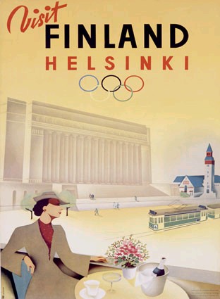
Poster for the cancelled 1940 Olympic Games
The simplification of form was used here to create a clear, direct poster. People were busy, messages probably had to be clearer, faster to read. Two important elements and asymmetrical balance, tosses the eye between the word Finland and the woman at the bottom. The eye is very strongly directed around this composition.

We've Beaten Them Before - Soviet poster (1942)

Suddenly they had to use what they knew about composition to create something emotionally compelling, the design is still fairly simple, but the details and contrasts create a more active, urgent picture.


Forbidden Planet - 1956
So we have compelling and clear... abused for mass marketing. Actually what I think is added here to the mix is interesting visuals. The composition is trying to keep the eye at the top of the page, but the picture leaves story up the the imagination. 


Grande Ballroom Grand Opening - Gary Grimshaw (1966)

Interesting visuals starts taking the lead, dropping clarity by the wayside. If it looks awesome but is hard to read, only the awesome people will attend, right? Stylistically, this breaks a lot of rules (too much text... at too many sizes... lines leading the eye off the page...) but it challenges the reader to pay attention, to be curious enough to understand it.

1960 – 1980: Album Covers

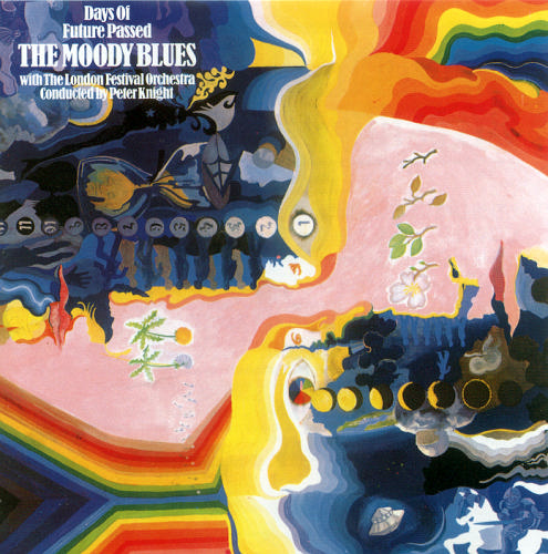
Days of Future Passed - The Moody Blues (1967)
Unusual visuals with a flipped symmetry make this interesting and eye-pleasing. The text in the top hand corner, however, feels like a total afterthought.

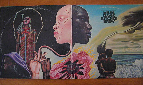
Bitches Brew - Miles Davis (1970)
Unusual, clear, playing with asymmetry and symmetry, the images are evocative and layered in potential meaning.

Grace Jones Studio Album Covers 1977–1989
When evocative fails to work, the 80's try shocking. The effort to stand out in a sea of other images really shows in these covers. Grace Jones starts with an interesting look, but keeps exaggerating it just to keep up with all the other images. The covers on the top row use text and painterly elements to create rhythm, while the middle row deals mostly with scale and tone contrasts. The two on the bottom left deal with rhythm more directly, creating a pattern from the repetition of elements.

1980 – 2000: Advertisements

Blarhg! Working on it! These are much harder to find online. There has to be a good collection out there!


Rhythm and Repetition:


Here are my attempts at Rhythm and Repetition.


One graphic element: Bilateral Symmetry

One graphic element: Rhythm

One graphic element: Radial Symmetry and Depth

Two graphic elements: Asymetric Balance and Rhythm

Three graphic elements: Asymmetric Balance and Complexity

Free Composition


Wednesday, September 22, 2010

Cart211: Class One

Thinking about networks I realized I'm not very spread out in my networks...

Most of my on-line activity is fairly solitary. Facebook, RolePlayMarket, DeviantArt, and Inkboard.Net being notable exceptions.
These were some of the inspirations for my attempts:
www.visualcomplexity.com/

http://www.blogviz.com/

There is a real fetish attached to charts and diagrams, especially masterful ones. Visual omnivores digest knowledge and one way to get it is through diagrams. (XKCD is a good example) Fractals and generated art give the eyes a lot of iterations to look at... Similarly to how illustrators/artists try to create complicated colours and patterns with watercolour or other paints, programs and programming can gain different but similar qualities.

composition by Veronika Schmidt,
 found at 
http://nodebox.net/code/index.php/Introduction 

Unplanned Muse by Nara Van Rossum Aug. 2010

The idea of injecting texture into digital work isn't new, but I've never really thought of it the other way around, creating complexity digitally from programmed input. Often textures are used to hide the digitalness of a work.
Eg: city-diversity by Betteo of Deviantart , Bamboo by Ikenai of Deviantart

http://cgtextures.com/ is one of the one-stop-shops for complexity from photos.

I suppose I'm still attacking these topics from a highly visual standpoint. All of my education so far has been heavily visual, as well as heavily applied to illustration rather than art. I think it will take me a few weeks for me to really get a feel for the real expanse digital arts.

Sunday, September 19, 2010

CART214: Class Two

I worked with flash ActionScript this week. I’ve never tried to use the code itself to draw before, it was a real puzzle. I still didn’t figure it all out yet. I wasn’t able to figure out how to fill circles made with a looping code, but I’ve learned how to read the code a lot better.
I found that it takes a lot of effort to simulate random variation! What is hard by hand is easy digitally, what is easy by hand is hard digitally.

Points_October Points_July

Points:
http://www.cromt.com/test/214_Assignment-1_Point1_October.swf
(Tension, Asymmetry, Size Contrast)
http://www.cromt.com/test/214_Assignment-1_Point2_July.swf
(Symmetry, Similarity, Size Contrast)

ActionScript code used: (Point1_October_Code) (Point2_July_Code) <---- Partially automated
See: http://e-articles.info/e/a/title/Drawing-a-Circle-using-ActionScript/


Lines_November Lines_August
Lines:
http://www.cromt.com/test/214_Assignment-1_Line1_November.swf
(Asymmetry, Similarity)
http://www.cromt.com/test/214_Assignment-1_Line2_August.swf
(Vertical Symmetry, Horizontal Asymmetry, Contrast)

ActionScript code used: (Line1_November_Code) (Line2_August_Code) <--- much simpler
See: http://flashexplained.com/actionscript/the-basics-of-drawing-with-actionscript/


Curves_December Curves_June
Curves:
http://www.cromt.com/test/214_Assignment-1_Curve1_December.swf
(Asymmetry, Contrast in Regularity)
http://www.cromt.com/test/214_Assignment-1_Curve2_June.swf
(Symmetry, Tension, Regularity)

ActionScript code used: (Curve1_December_Code) (Curve2_June_Code) <--- This gets ridiculous, be warned.

Monday, September 13, 2010

CART214: Class One


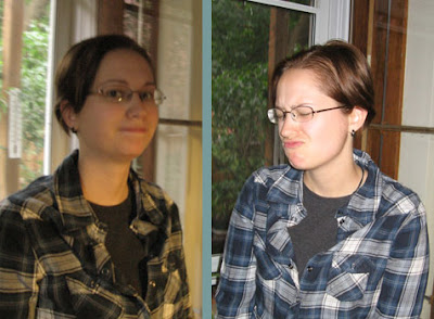
Representative / Interpretive

Two photos, seconds from one-another, representing my normal, mellow self and interpreting my less frequent, more dramatic self. I chose the first photo as representative because I didn't have very much time to prepare for it. I tend to make faces in photos, especially if given too much time to prepare. This photo is probably closer to how others see me in every-day interactions. In the second photo I really had time to think about how much I dislike getting pinned down in a photo. It shows off the nasty habit I have of not seeking out objective data and rejecting it if negative, especially when it has to do with things I care about. I'm an eye on the world that really doesn't appreciate being looked back at with the same level of criticism. Not that I can't take it! Especially when it comes to art, I've got a much thicker skin.