Research:
(All images are links to their source page.)
1920 – 1940: Paintings
 |
| A September Gale - Arthur Lismer (1921) |
Breaking down reality into perfect elements seems to be the theme of this time period. This early group of seven piece is asymmetrical and slightly off balance, the colours and rhythm of directional elements create an energized feel to it. I have trouble keeping my eye on the right, my eye always sweeps with the current.
More formal use of shape here contrasting with the very organic fur of the cuffs. The arms and face make a rhombus that keeps the eye mostly in the top half of the image.
1940 – 1960: Posters
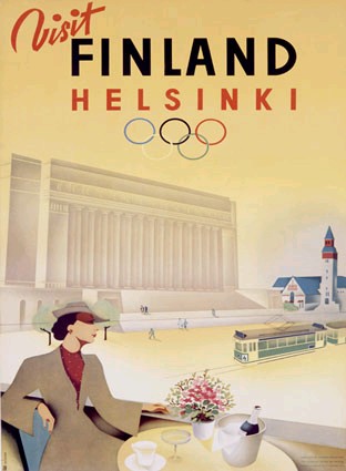 |
| Poster for the cancelled 1940 Olympic Games |
The simplification of form was used here to create a clear, direct poster. People were busy, messages probably had to be clearer, faster to read. Two important elements and asymmetrical balance, tosses the eye between the word Finland and the woman at the bottom. The eye is very strongly directed around this composition.
 |
| We've Beaten Them Before - Soviet poster (1942) |
Suddenly they had to use what they knew about composition to create something emotionally compelling, the design is still fairly simple, but the details and contrasts create a more active, urgent picture.
 |
| Forbidden Planet - 1956 |
So we have compelling and clear... abused for mass marketing. Actually what I think is added here to the mix is interesting visuals. The composition is trying to keep the eye at the top of the page, but the picture leaves story up the the imagination.
 |
| Grande Ballroom Grand Opening - Gary Grimshaw (1966) |
Interesting visuals starts taking the lead, dropping clarity by the wayside. If it looks awesome but is hard to read, only the awesome people will attend, right? Stylistically, this breaks a lot of rules (too much text... at too many sizes... lines leading the eye off the page...) but it challenges the reader to pay attention, to be curious enough to understand it.
1960 – 1980: Album Covers
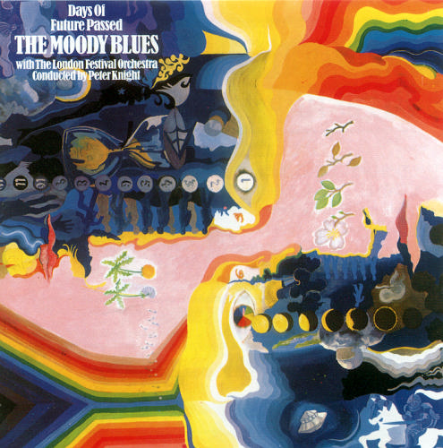 |
| Days of Future Passed - The Moody Blues (1967) |
Unusual visuals with a flipped symmetry make this interesting and eye-pleasing. The text in the top hand corner, however, feels like a total afterthought.
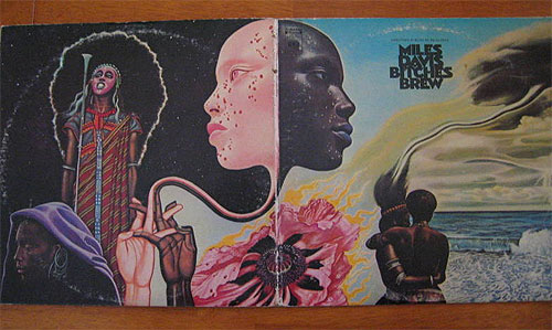 |
| Bitches Brew - Miles Davis (1970) |
Unusual, clear, playing with asymmetry and symmetry, the images are evocative and layered in potential meaning.
 |
| Grace Jones Studio Album Covers 1977–1989 |
When evocative fails to work, the 80's try shocking. The effort to stand out in a sea of other images really shows in these covers. Grace Jones starts with an interesting look, but keeps exaggerating it just to keep up with all the other images. The covers on the top row use text and painterly elements to create rhythm, while the middle row deals mostly with scale and tone contrasts. The two on the bottom left deal with rhythm more directly, creating a pattern from the repetition of elements.
1980 – 2000: Advertisements
Blarhg! Working on it! These are much harder to find online. There has to be a good collection out there!
Rhythm and Repetition:
Here are my attempts at Rhythm and Repetition.
 |
| One graphic element: Bilateral Symmetry |
 |
| One graphic element: Rhythm |
 |
| One graphic element: Radial Symmetry and Depth |
 |
| Two graphic elements: Asymetric Balance and Rhythm |
 |
| Three graphic elements: Asymmetric Balance and Complexity |
 |
| Free Composition |


No comments:
Post a Comment